Google Analytics makes it easy to compare statistics, and that’s important for understanding trends, spotting changes, and, hopefully, patting yourself on the back for increased visitors.
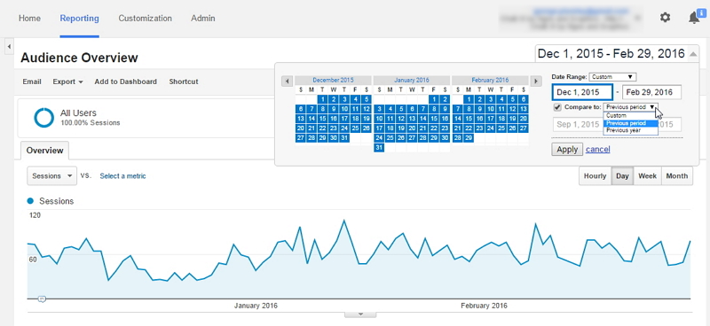
You’re probably already familiar with the date picker at the top right of the Google Analytics reporting screen – by clicking on it you get a calendar for choosing your date range:

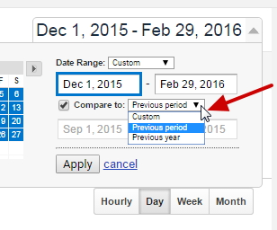
What you may not have noticed is the small drop down called Compare to. If you check the box next to it, the dropdown becomes active and you can choose from the Previous Period, the Previous Year, or a Custom date range.

The two pre-sets are handy because they take whatever date range you’ve chosen – in this case, a three month period – and finds the same range from the previous year or for the period immediately prior to your starting date.
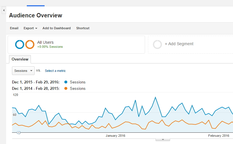
When you apply the comparison, you get a chart that clearly distinguishes between the two periods:

And, in this case, it’s definitely cause for celebration!
What's Your Take?