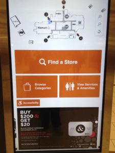
My local shopping mall recently changed their electronic directory and those changes provide an important lesson for website home pages: keep it simple.
In a post warning against overcrowded home pages, I talked about having no more than three or four ideas on the home page. Here’s what the new mall directory looks like:
 There are basically three options.
I wish I had a photo of the original, but it was the typical long list of all the stores broken down by categories and each category was colour coded. The designers had done their best to help you scan through the material, but still, it was a huge eyeful.
There is an extra step in this new design – an extra click – to get you to where you need to be, but it’s ultimately faster because you haven’t had to spend the time finding your way through a lot of irrelevant material.
The other important element of this new design is that three options are presented to you in a very obvious way – big buttons with simple text and icons. Stripping down the content to three elements would not be as effective if the three buttons were crowded and heavy on design (gradient backgrounds, lots of lines, lots of images, etc.). Keeping it simple should apply across the board.
What's Your Take?