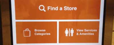
My local shopping mall recently changed their electronic directory and those changes provide an important lesson for website home pages: keep it simple. In a post warning against overcrowded home pages, I talked about having no more than three or four ideas on the home page. Here’s what the new mall directory looks like: There are […]
Don’t Let Black Friday Hosting Deals Ruin Your Website
Every November, during Black Friday sales, you’ll be inundated with ads for 70% or more off hosting for your website. Stay calm and don’t get caught up in the frenzy. Bad hosting is bad, even if it’s really really cheap. Sure, most hosting companies, good or bad, will move your existing site for free in […]
Should I Have an Email Newsletter or a Blog? You Need Both.
I saw this question posed in a LinkedIn discussion, but I hear it all the time: Should I have an email newsletter or a blog? The answer is: it’s the wrong question. Most small businesses should have both, and the question should be: What kinds of email newsletter and blog should I have? By “email newsletter” I mean something […]
Hidden Order Summary On PayPal Checkout May Be Confusing Customers
In 2015-16, PayPal has been making major changes to its user interface, including its checkout pages. A client called me the other day saying there might be something wrong with a PayPal button on their site. Some of her customers thought they were in the wrong place when they arrived at PayPal after clicking the button. When I […]
Check Your Site For Outdated Content
If you’re not visiting your own website regularly, you could end up with outdated content, and the consequences can be serious: from visitors trying a phone number that no longer works, to visitors seeing your company as lazy because there’s a signup link for an event that took place last year. Here are some key types of […]
The Question And Answer Post
Answering questions from your customers and clients is a great source of material for your website’s blog. Not only are you providing valuable information, but you know that this is information people are looking for, so it will really help your search engine visibility. Even if you already have a Frequently Asked Questions page, you can […]
Do You Know How Many People Are Clicking Your Email Signature?
First of all, congratulations for putting your website address in your email signature. You’ve made it easy for correspondents to get to your site. But are you tracking how many of them click on that link? If you’re using Google Analytics for your site statistics, it’s a snap to see the number of clicks. You can even […]
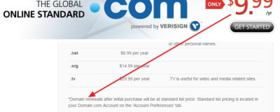
The Truth About Domain Name Pricing Is In The Fine Print
When you’re buying a domain name it’s easy to be distracted by flashy advertising of low prices, but to know what a domain name is truly going to cost you over time, look for the fine print:
Is Your Home Page Overcrowded?
An organization I once worked for had a staff of about 40 people. Every few days I would get an email from one of them asking me to put a “really important” item on the website’s home page. “Oh, and make sure it’s really visible, near the top if possible.” It didn’t take long for that home page to […]
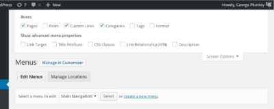
Seeing All Available Menu Items in WordPress
Knowing what possible menu items you have available is important, but depending on where you’re editing menus, those items may not be obvious. Editing from Appearance -> Menus On the desktop Menus screen, possible menu items are on the left, while in mobile mode they’re the first section as you scroll down.
Making Website Text Easy To Read – Font Size
Is the body text on your website too small? The trend over time has been to increase font size so visitors don’t have to squint to read. Body text size should be at least 16px (pixels). Compare text on the CNN website in 2004 with 2016:
- 1
- 2
- 3
- …
- 12
- Next Page »


