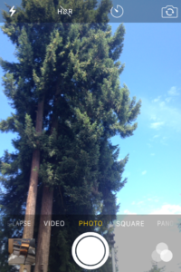
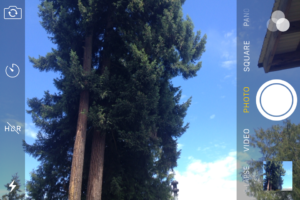
I had a client send me photos from their smartphone the other day, to use in a slideshow on their website. Problem was, the slideshow is wide and not very tall, while the images were narrow and really tall. We had to crop the photos and several of them really didn’t work at all when you did that.
We tend to take pictures and video in the position we normally hold our phones – vertically. This is called portrait orientation. But often what we need is landscape orientation, when you hold your cellphone horizontally.
- Portrait Orientation
- Landscape Orientation
Ultimately, the orientation should be determined by what you’re trying to capture. But when the picture is for your website, you also need to think about how it’s going to be used.
For example, if it’s for the sidebar, you don’t have much width to work with, so portait or vertical images make sense. When you’re thinking of an image to go in a slideshow or across the top of a blog post, you’ll likely want something in landscape or horizontal position.
If you’re ever in doubt, take a photo in each orientation so you’re not stuck, no matter where you end up using it.


What's Your Take?