My local shopping mall recently changed their electronic directory and those changes provide an important lesson for website home pages: keep it simple. In a post warning against overcrowded home pages, I talked about having no more than three or four ideas on the home page. Here’s what the new mall directory looks like: There are […]
Hidden Order Summary On PayPal Checkout May Be Confusing Customers
In 2015-16, PayPal has been making major changes to its user interface, including its checkout pages. A client called me the other day saying there might be something wrong with a PayPal button on their site. Some of her customers thought they were in the wrong place when they arrived at PayPal after clicking the button. When I […]
Is Your Home Page Overcrowded?
An organization I once worked for had a staff of about 40 people. Every few days I would get an email from one of them asking me to put a “really important” item on the website’s home page. “Oh, and make sure it’s really visible, near the top if possible.” It didn’t take long for that home page to […]
Making Website Text Easy To Read – Font Size
Is the body text on your website too small? The trend over time has been to increase font size so visitors don’t have to squint to read. Body text size should be at least 16px (pixels). Compare text on the CNN website in 2004 with 2016:
Google’s New Mobile Friendly And Speed Test Tool
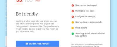
Google has revamped and combined its tools for testing how mobile-friendly a website is and how quickly it loads. Simply enter the URL of the page here and wait for the results.
Test Any Mobile Device From Your Browser
I’m not interested in getting an iPad. But my clients need their websites to look good on an iPad, so how can I test in that format? Luckily, web browsers these days have simulators to show you how a site looks on most popular types of mobile devices. Note: simulators cannot match every single aspect of a […]
Check The Mobile Friendliness Of Every Page On Your Website
Is your website completely mobile-friendly? On one of my webinars recently, 7 small business owners volunteered to have their websites assessed. Only one of them failed the Google Mobile Friendly Test. So far, so good. The problem was: ALL of the mobile-friendly sites had at least a few serious design or readability flaws on smartphones and tablets. Look […]
What Is The Difference Between Responsive And Mobile-Friendly?
A website design can be mobile-friendly without being responsive. I’ve always taken the distinction for granted until I was recently doing a website review for a new client. I noticed they were using WP Touch, a WordPress plugin that creates a mobile-friendly version of a website. This puzzled me because the theme they were using was responsive – that is, […]
Generate Tiled Background Textures And Patterns
While we’ve moved on from the days of over-using background photos behind web text – beach pebbles, wood, and so on – sometimes it’s nice to have a bit of texture or a pattern lightly visible on a coloured background. The Background Image Generator does exactly that. It’s a free tool from SiteOrigin, a company […]
A List Of Sites To Help Choose Google Fonts
Google Fonts contains a huge library of free web fonts you can use on your site, but choosing a good combination of headline and body fonts is not easy (on this site I’m using Oswald for the headings and Lora for the body text). Here are some sites that make the job easier: Font Pair […]
Making Website Text Easy To Read – Font Weight
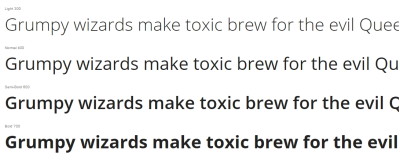
In this installment of my series about the readability of website text I take a look at font weight. The weight of a font determines the thickness of the lines in the text. Bold text has a heavier weight than normal text, so it looks thicker and darker. CSS or cascading style sheets for websites use a font-weight scale […]


