 I’m not interested in getting an iPad. But my clients need their websites to look good on an iPad, so how can I test in that format?
Luckily, web browsers these days have simulators to show you how a site looks on most popular types of mobile devices.
Note: simulators cannot match every single aspect of a device and there will be times when something looks or works fine in the simulator, but not on the actual device.
Here’s how the mobile simulators work on major browsers:
(I’ll be adding Firefox, Safari, and Edge shortly)
Google Chrome
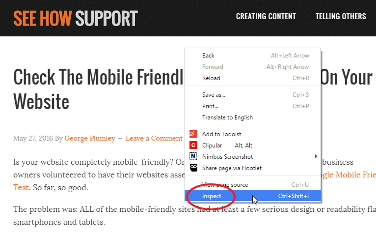
To access mobile view, you simply right-click anywhere in the browser window and from the popup menu, choose Inspect near the very bottom.

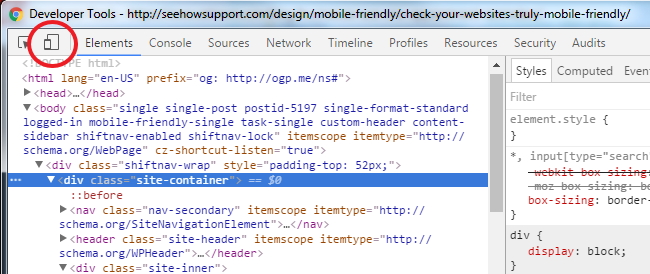
Depending on how your browser is currently set, a Developer Tools pane will open at the bottom or right side of the window OR a new window will open.
Don’t worry about all the code you see in this pane or window – look at the top left corner and you’ll see a little icon with two overlapping screens. Click that icon.

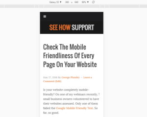
Your browser changes to show a mobile version of the site in the very middle of the window.
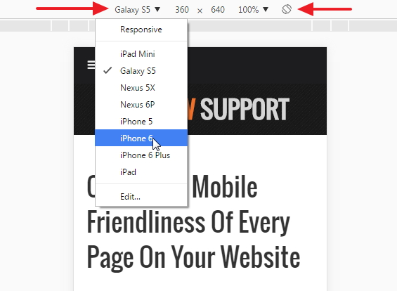
Above the mobile view is a small menu, and at the left of it is a drop down where you choose which device you want to simulate:

And over on the right of that little menu is an icon of a rotating screen. You click that to switch between portrait (vertical) and landscape (horizontal) mode.
What's Your Take?