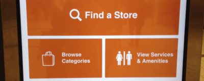
My local shopping mall recently changed their electronic directory and those changes provide an important lesson for website home pages: keep it simple. In a post warning against overcrowded home pages, I talked about having no more than three or four ideas on the home page. Here’s what the new mall directory looks like: There are […]
Hidden Order Summary On PayPal Checkout May Be Confusing Customers
In 2015-16, PayPal has been making major changes to its user interface, including its checkout pages. A client called me the other day saying there might be something wrong with a PayPal button on their site. Some of her customers thought they were in the wrong place when they arrived at PayPal after clicking the button. When I […]
Is Your Home Page Overcrowded?
An organization I once worked for had a staff of about 40 people. Every few days I would get an email from one of them asking me to put a “really important” item on the website’s home page. “Oh, and make sure it’s really visible, near the top if possible.” It didn’t take long for that home page to […]
Making Website Text Easy To Read – Font Size
Is the body text on your website too small? The trend over time has been to increase font size so visitors don’t have to squint to read. Body text size should be at least 16px (pixels). Compare text on the CNN website in 2004 with 2016:
Google’s New Mobile Friendly And Speed Test Tool
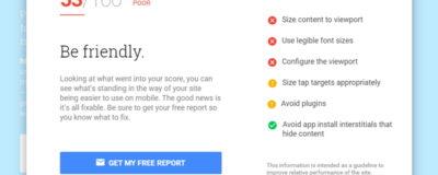
Google has revamped and combined its tools for testing how mobile-friendly a website is and how quickly it loads. Simply enter the URL of the page here and wait for the results.
Making Website Text Easy To Read – Font Weight
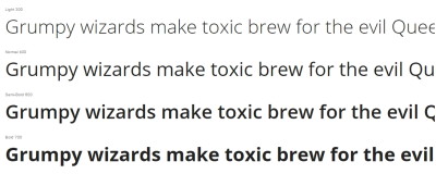
In this installment of my series about the readability of website text I take a look at font weight. The weight of a font determines the thickness of the lines in the text. Bold text has a heavier weight than normal text, so it looks thicker and darker. CSS or cascading style sheets for websites use a font-weight scale […]
Do You Really Need A Home Link On Your Site Navigation?
You don’t need a Home link on your navigation, provided your logo or company name is linked to your home page. Keeping your navigation menu as simple as possible makes for a better user experience, and one easy way to minimize navigation is to remove the home page link. This assumes, of course, that you’re linking […]
Making Visitors Click Too Much?
Site speed is one factor that sends visitors running, but another is having to click too many times to get what they need. Check your site to make sure the good stuff isn’t more than a click away. Here are some situations to watch for: Unnecessary “entry” pages. These are pages with no navigation except […]
