 An organization I once worked for had a staff of about 40 people. Every few days I would get an email from one of them asking me to put a “really important” item on the website’s home page. “Oh, and make sure it’s really visible, near the top if possible.”
It didn’t take long for that home page to become so crowded that nothing was important.
Now, some types of websites, like magazines or directories need a fair bit of material on their home pages, but for small business websites my rule of thumb is:
There should be – at most – only three or four ideas on the home page at any one time.
Just as users won’t wait long for pages to load, they won’t take the time to sift through dozens and dozens of options. This is particularly true of home pages, which are meant to be a kind of table of contents. Let me know I’m in the right place for what I need, then give me a few options where to go for the details. That’s what your home page should do.
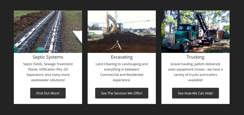
I have a client in the excavation business. They do a lot of things, but we boiled it all down to three key areas: septic systems, excavation, and trucking. That’s pretty much all you see on the home page.

Click one of the three and you see what they do within that area. In the case of excavation, there’s an easy to read list of all excavation services, and you click one of those to get its details.
You need to reduce your business to its most important parts. But remember, it’s not what’s important to you. Group what you offer into a few areas that have meaning to your visitors and that meaning includes a sense of what sub-areas they’ll find in that group.
 And use visuals to help communicate that meaning. Seeing a truck is often a better trigger than the word “Trucking.” Make sure the image isn’t ambiguous. This can be hard for more conceptual categories, such as Taxes.
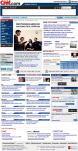
The entire design of your home page should make it visually easy to decide what to do next – large text, white space between elements, large images, minimal graphics – unlike what we used to do back in, say, 2004. Yikes.
Consider doing some user testing when planning a new or evaluating an existing home page. Find a friend who would be a user of the site. For example, find someone who needs bookkeeping services rather than a bookkeeper.
Ask the person to look for a particular service or product on your site, then let them loose on your home page. How quickly can they find what they need?
And keep re-evaluating your home page. Visitor needs, as well as your priorities, change all the time, so make sure your home page is keeping up. This can be as simple as changing out an image so that returning visitors are seeing something new or rearranging three boxes because the one on the left is what visitors see most often.
But don’t just keep adding to your page, or you’ll end up with a mess. Use the rule we have around our house: if you add one item, take another away.
What's Your Take?